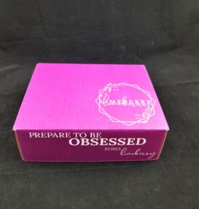
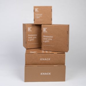
We love to post about the branded packaging trends we’re seeing, —both old and new, as a way of featuring some of our favorite colors, prints, patterns and structural designs. The new year is well underway, and we have already seen some amazing designs from a variety of our customers that are looking for ways to differentiate themselves and their packaging in crowded and competitive DTC ecommerce markets.
You can see these examples below, and we encourage you to reach out to us with any that catch your attention, or leave you wanting for more information.
Repeat Patterns
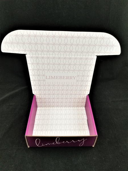
There is perhaps no hotter design feature than repeat patterns right now. Repeat patterns are not unique to 2021, (we’ve been doing them for years) but the recent trend may be due to the fact that it’s a subtle but beautiful way of featuring your brand name, logo, URL or other aspect without drawing too much attention away from the product or overwhelming the customer. You can read more about repeat patterns by clicking on the first link at the bottom of this post.
Interior Prints with Matching Inserts
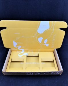
While again this is nothing new or groundbreaking, but we are seeing more and more printed inserts, interior prints and in many cases designs where the inside lid and walls of the mailer are coordinated with the insert print to match or create a complete design like in the photo below. When done right, it can make for a great eye-catching result.
Natural/Green/Eco Look (Classic White on Kraft)
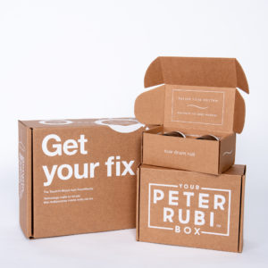
I’m not even sure you can call this a “trend” at this point, so much as it is a yearly continuum in our industry, but the fact remains that almost every day we receive a call from someone who is looking for that natural green-looking box that conveys an eco-minded brand to their customers. This is typically accomplished with 1 color prints on all kraft recyclable board, and perhaps none more popular than our classic white on kraft. As you can read about in this post, white on kraft can be challenging, but we excel at it!
Colors that Pop and Flood-coats
No two flood coats are the same, as board and ink are the important factors that play into the end result on these designs. Certain inks may cover better than others, and many inks may call for a varnish to be applied as an additional step in the production process. This can help to prevent rub-off, help bind the ink to the board, and create an extra coating of protection to that ink, or even a bit of a sheen to the finish.
We love working with and printing bold and exciting colors, as you can see below. And there are a variety of options available to you, including printing dark colors over light, reverse prints (utilizing the board color) and multiple color prints that pop.
Unique Structural Designs and Concepts
In addition to graphic design, which, ultimately we leave up to you and your graphic artists, structural design is another component to consider, and one that we take great pride in. Unique, new and interesting structural designs are trending right now in DTC packaging, as many companies try to discover different ways to send their products without relying on a traditional lock front or top tuck mailer, or RSC. This has resulted in many hours of hard work from our design teams, and generated many amazing concepts such as our Ta-Da Box, which you can read more about here.
Please Contact Us Today
Want to be on the cutting edge of the next branded packaging trends? As always, if you have any questions, one of our branded packaging advisors is standing by to assist, with decades of experience behind them. Want to know more about custom packaging options? Please call us at 630-551-1700 or contact us via email at www.SalazarPackaging.com.
Related Posts:
https://www.salazarpackaging.com/2021-e-commerce-packaging-graphic-design-trends-for-boxes/
https://www.salazarpackaging.com/top-five-2021-trends-in-dtc-e-commerce-packaging/


