 The difference between structural design and graphic design on packaging is often described as the difference between the canvas maker who builds the surface to be printed and the artist who paints on it. That is probably not an unfair comparison but in our case, we also help to guide the (graphic) artist to a creating a design that will print well on the corrugated box that becomes their canvas.
What happens when outstanding graphic design meets great structural design – you end up with a finished design that looks great, performs well and is user friendly.
Artezen and Salazar Packaging Team Up!
We were contacted by a great branding and graphics company who had been charged with creating a branded package for one of their favorite clients. To be frank, after a brief conversation, we still did not have any idea what the product was or how it would be packaged. However it became apparent the items being shipped would require some internal packaging for protection as well as presentation.
This of course made it an ideal application for our design team so I invited Artezen to send us a complete product sample for review. Our people quickly determined what type of internal packaging design would best work and we were able to give Artezen some preliminary numbers for the box, the insert and the tooling and plates that would be required.
At some point you have to make sure the concept is viable and will do the trick. In this case we not only had to convince Artezen, they also had to make sure their client was pleased with the structural design. We delivered a sample of the box and insert that was easy to use and assemble, so everyone loved it. It was accepted “as is” saving precious time and money.
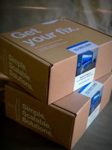
This enabled us to quickly provide Artezen with a die line for the box so they could do what they do with their graphics. They chose to go with a basic (and very popular) white on Kraft graphic design and used a full color label not only to show the product, but also to seal the box.
 The whole package looks great, is very efficient in terms of assembly and packing, was very reasonably priced, and most importantly, we all met the client’s deadline. The photos included in this post show the results of our combined talents.
If you need a good branding house with great graphic artists, please check out the nice people at www.Artezen.com. If you need a corrugated shipping container that is well built, attractive and easy to use, contact us at Salazar Packaging or call us at 630-551-1700. Whether you are the end user/client or the design form quarterbacking the e-commerce or subscription packaging project, one of our experienced branded packaging advisors is sure to help you meet your objectives in terms of design, cost and deadline.
Related posts:
http://salazarpackaging.com/e-commerce-boxes-that-sparkle-and-shine/
https://www.globeguardproducts.com/industry-experts/seven-reasons-right-size-subscription-box/


