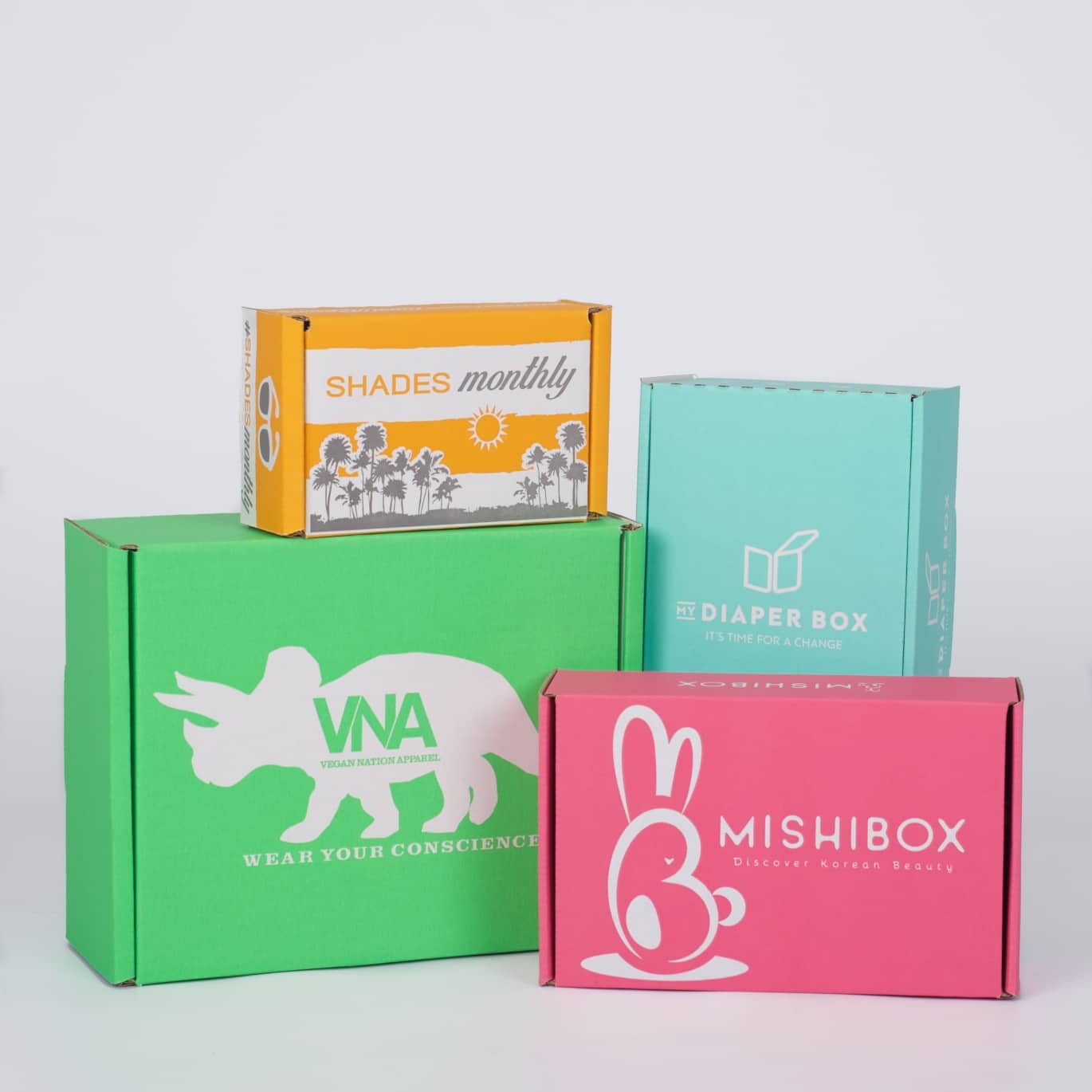
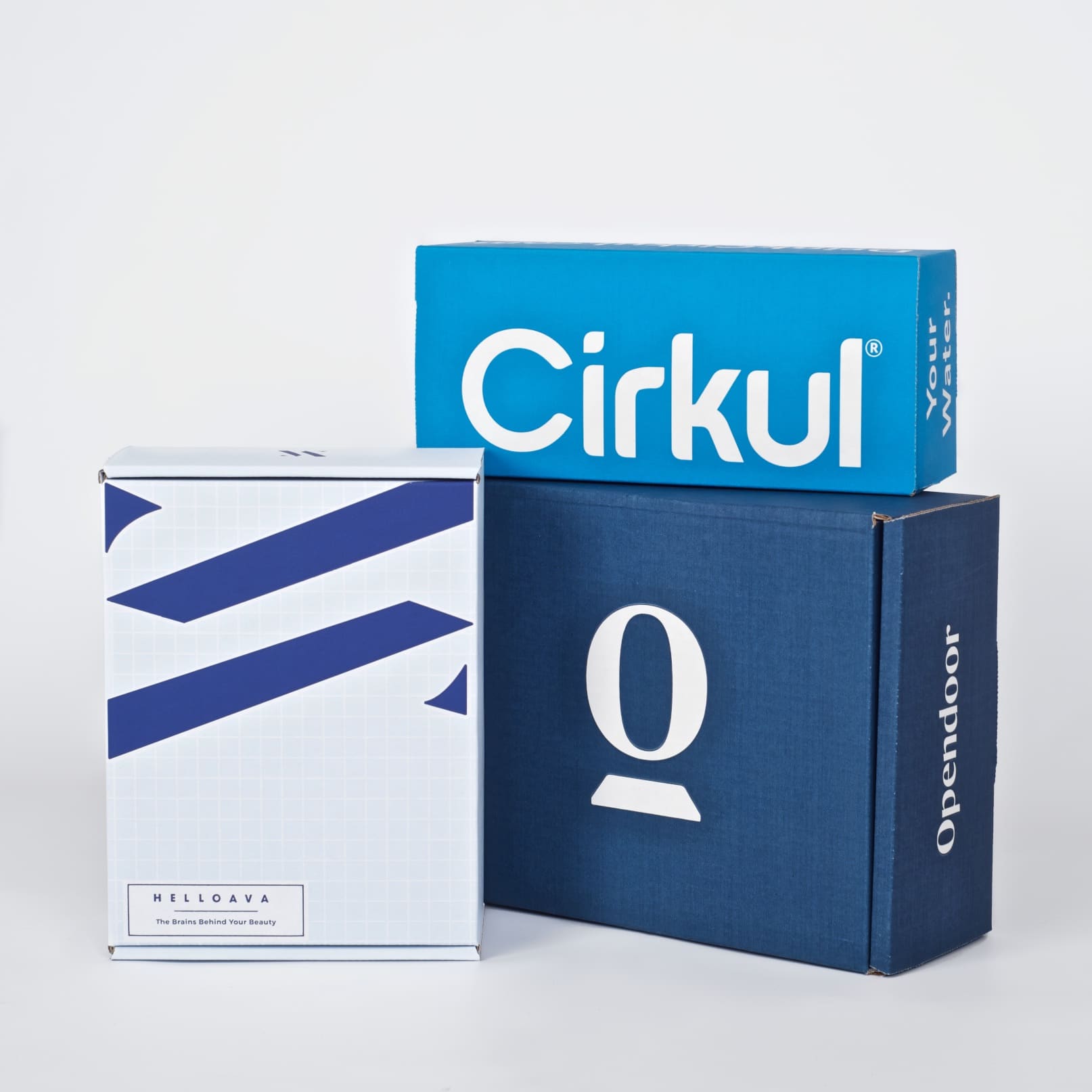
In the Chicago suburbs, we’ve seen one of the harshest and coldest winters on record. But March has brought much-anticipated relief, as the start of spring fast approaches. Aside from the always-hectic late-fall/December holiday season, spring is one of our busiest times of year with many warm-weather seasonal businesses launching ahead of the summer months. It’s an exciting time for us because some of our most colorful designs come from customers around this time of year. With our vast experience (we’ve been doing this for 12 years now) there are some tips we can offer to create branded, bright colored packaging that pops and best represents the uniqueness of your brand.
Ecommerce Low-Cost Creativity in Color
Color will be the first thing that stands out about your box, and in many cases it will leave the lasting impression you desire long after its arrival. After printing millions of boxes for thousands of customers, we still get excited when we have the opportunity to print a design with a unique color or colors we haven’t seen before.
Keep in mind that we can match nearly any Pantone (PMS) color at no extra charge, so you are not limited by choice, only by imagination. While it is true that certain inks will print better on a specific board color (white or kraft), we will always send an ink sample or multiple ink samples showing the ink on different board colors once you have placed an order, ahead of production.
Quite often we are asked what the price difference is between a black box vs. a red box and so on. The simple answer is, the ink color itself does not affect the cost, but board color will. White board is about 6% more expensive than kraft board, and many colors will pop better on white, but there have been countless beautiful prints of various colors on kraft as well.
Flood Coats and Reverse Printing
A flood coat is essentially an edge to edge print, covering at least 75% or more of the board on one side (inside or outside, or sometimes—though rarely—both). This is sometimes done as a full flood of one ink color or as a reverse print, where text or copy appears as the board color (kraft or, more often white) and the ink fills in around it. Reverse printing is an effective way of creating a 2 color look for the price of 1, utilizing the board color in the design.
The difference in cost between a flood coat or reverse print design, and a more basic, positive copy print is very minimal (usually pennies) on a per box comparison, assuming the same board color is used in both cases. The difference will come in the form of the one time print plate costs, which once purchased, can be used over and over again for as long as you are not changing your design or box size. For FULL flood coats covering 100% of the board, we typically are able to use a matte in-house print plate at no charge to you, although it will depend on the specific size of the mailer, and it must be complete ink coverage of one side of the board (inside or outside).
There are some designs that call for a flood coat with text/graphics printed over the solid coat of ink. However, this is not often recommended, and we are likely to discourage this as a flexographic print option because of the risk of the bottom color bleeding through the top. Flexographic printing always works best when there are gaps between colors.
Please Contact Us Today
Want to know more about bright colored packaging that pops? We’re happy to walk you through an initial consultation and find a custom packaging solution that works for you. As always, if you have any questions, one of our branded packaging advisors is standing by to assist, with decades of experience behind them. Want to know more about custom packaging? Please call us today at 630-551-1700 or contact us via email at www.SalazarPackaging.com.
Related Posts:
https://salazarpackaging.com/add-color-to-your-e-commerce-and-subscription-boxes-for-the-wow-factor/
https://salazarpackaging.com/the-cost-of-custom-printed-branded-d2c-packaging/


